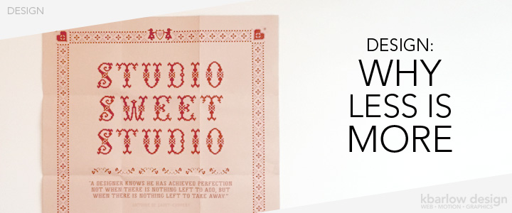
I love a minimal look. I have an awesome poster that came in the mail from Veer several years ago that has a quote under it that reads:
“A designer knows he has achieved perfection not when there is nothing left to add, but when there is nothing left to take away.”
– Antoine De Saint-Exupery
I think it says a lot. It’s easy to look at a design and think “I need to add more, it’s not right just yet”, when really – simplifying the design is what will make the message clear. That’s what design is – it’s communicating a clear message (in a beautiful way).
A minimal website design:
- allows enough space for the message to make the most impact
- helps to create a clear path for your visitors to take (right to those call-to-actions!)
- focuses on the hierarchy of information – highlighting the most important information first
- looks more professional – too much happening can imply disorganization, scattered direction, and a lack of focus
Keep your focus your message clearly, keep your design elements purposeful, and you’ll see a big impact in your credibility!
P.S. I really liked that the poster also says “studio sweet studio”, and started to recreate in cross-stitch, but ended up in my pile of “to be completed” crafts – oops!

